From a creative professional's perspective, Sneha and Dylan were dream clients. The did research, they "shopped local," and they visited the studio — both to talk with Travis, and to see (and feel) letterpress samples in person. Most importantly, they had a solid design vision and provided concrete inspiration and references.
Parklife Press did custom designs for both the save the date card and the invitation set. For the former, Sneha and Dylan said they wanted "whimsical ... like the opening scenes of a Wes Anderson film." (For a graphic designer and film buff to hear this? He knows it's the start of a fun job.)
The list of inspirations for the invitation set was longer, but no less interesting to fit together. To start with, it was to be "a bit more formal" than the save the date cards.
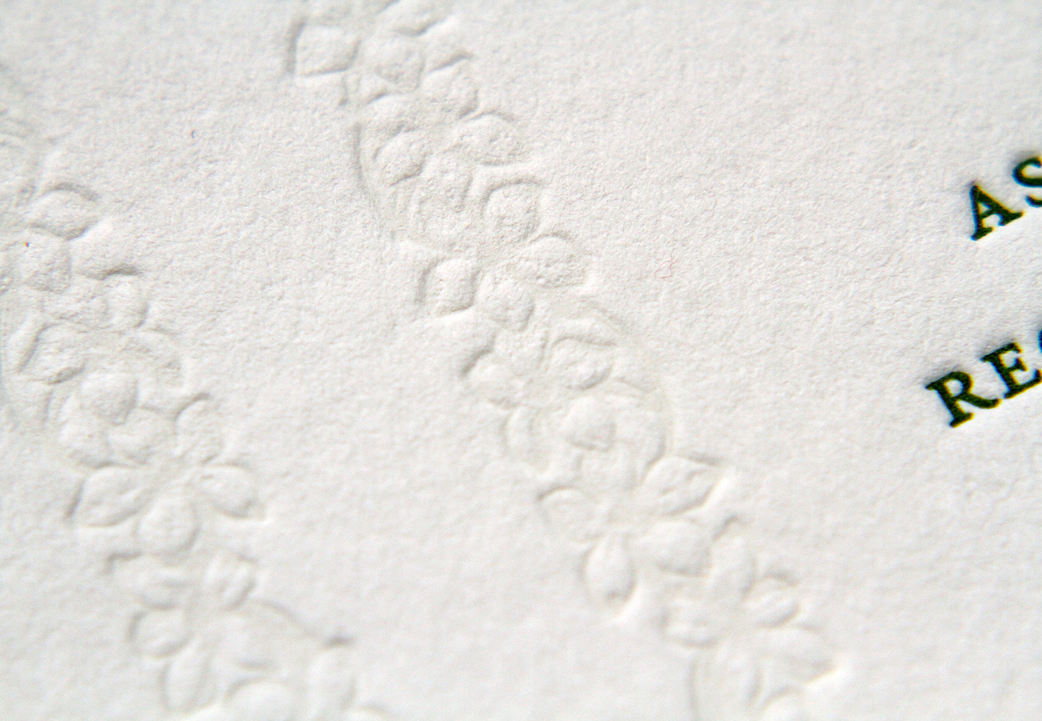
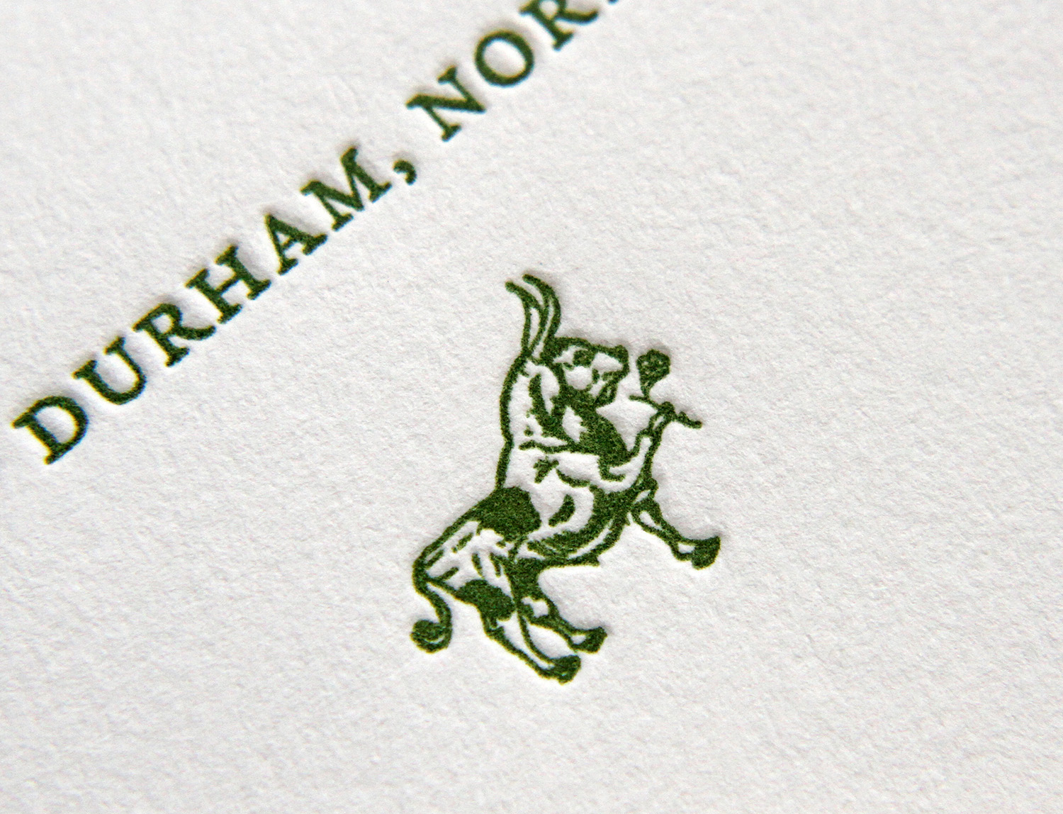
For the couple, it was tiny details that made this set distinctive and personal. They wanted to incorporate "flower garlands from traditional Indian weddings." To do this, Travis used a blind deboss impression — thereby lending texture to the background and creating a subtle, striped effect which was in keeping with the design's formal tone. Sneha and Dylan chose the green and gold colors they "often see in the beautiful forests here," colors which they used in the wedding and reception. (The heavy-weight cards were edged in gold, setting off the deep green of the text.) And finally, they wanted to "give a nod to our new home in Durham by featuring a romanticized bull." That bull, extending a single rose, appears on both the save the date card and on the invitation's envelope flap return address.
Commissioning custom designs, especially when the turnaround time is short, can be nerve-wracking for clients. But it was a positive experience for Sneha, who said, "Travis was so easy to work with and incredibly quick to respond to our edits." And the resulting product really set the tone for their big day: "We have received more compliments on the invites than we could have ever imagined," she said. "He helped two very time-constrained and design-naive individuals make absolutely beautiful invitations we will treasure forever."


