Grass and Stone
Addie had always been drawn to letterpress. Having few letterpress options in
Greensboro, they found Parklife Press when searching for studios in the
Durham area. Working under a tight deadline and having little time to spare, they were pleased when Parklife's website showed a "clear design aesthetic as well as up front design details and pricing options," and felt that the format prepared them for a seamless consultation with Travis. They were immediately drawn to the Parker design because it was clean and simple, and they loved its use of typography.
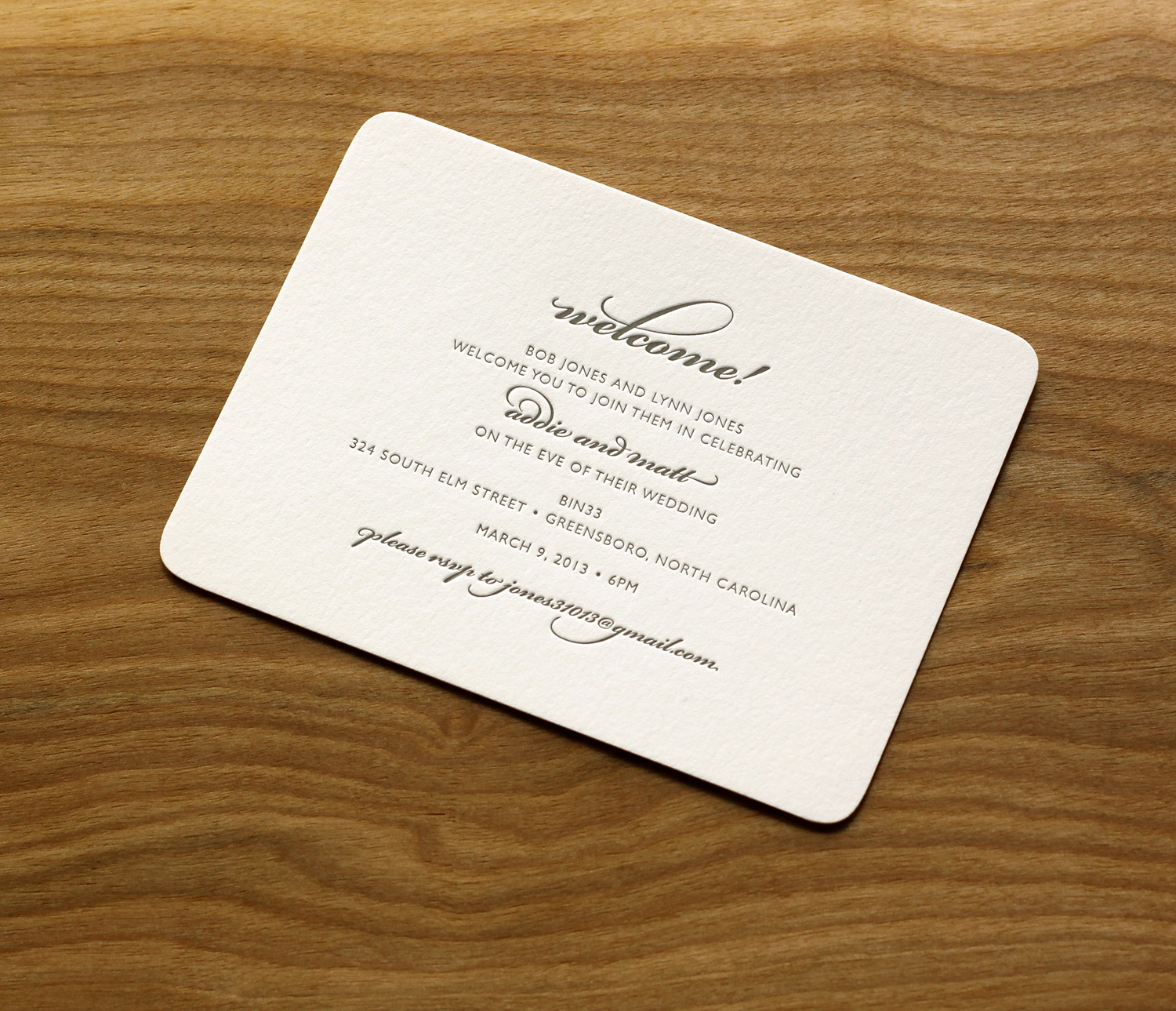
They used grass and stone inks throughout. The green, used sparingly — for their names, the RSVP postcard-style return address, and for the invitation's edge painting — was a nice touch for their not-quite-spring wedding in March. "It felt really fresh and added just enough pop," Addie says. They ended up using the colors and color names as a thematic springboard — "grass and stone" became a motif at their wedding, with centerpieces of planters of grass, and stone-colored bridesmaids dresses.
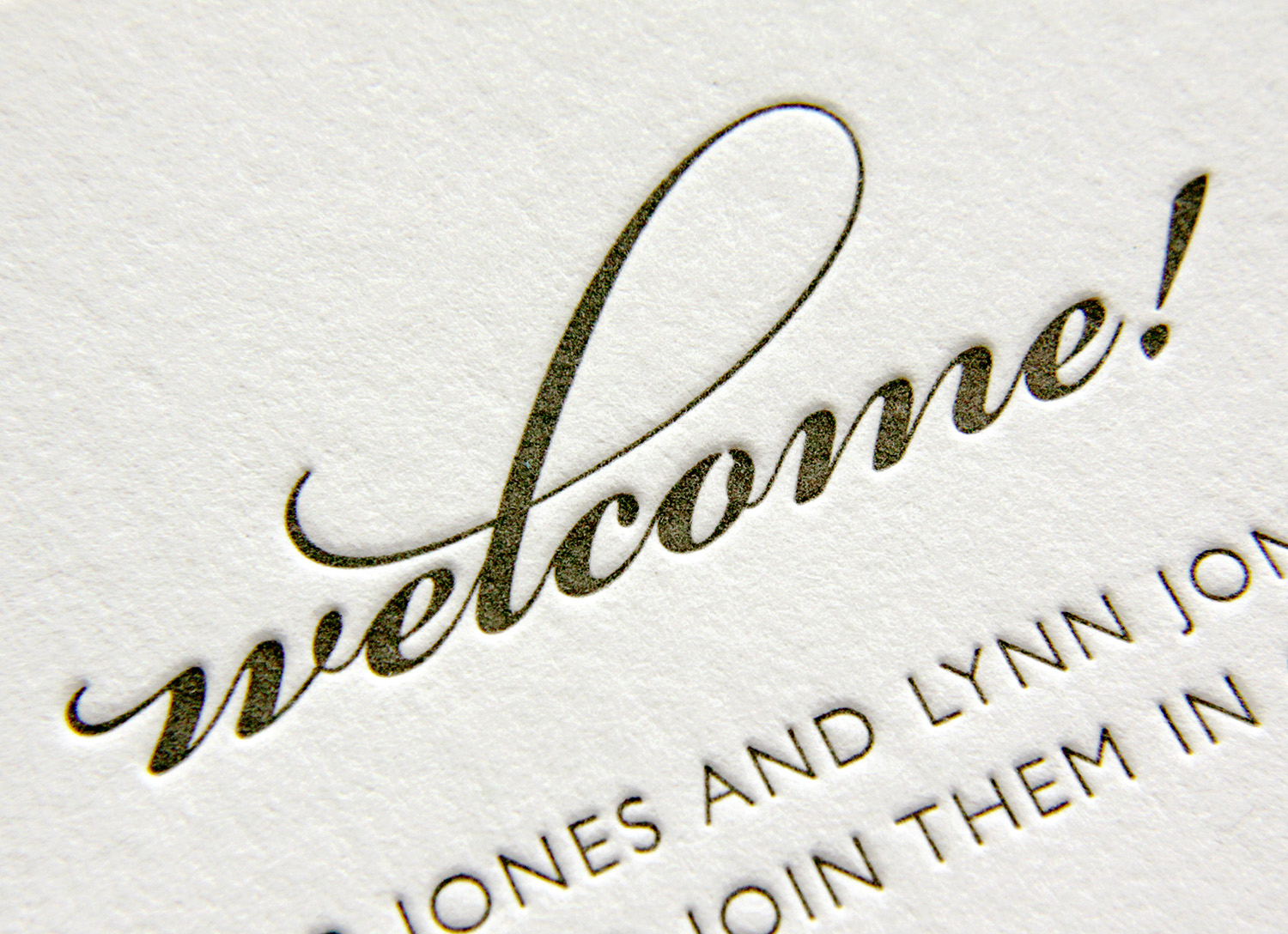
The RSVP and welcome cards provided another showcase for the dramatic pop of typographic embellishment. This particular script font comes with an extensive set of alternative characters and ligatures, providing lots of options for the designer. Choosing which to use and where is key. Addie noted, "Travis gave great suggestions on how and where to add flourish to our names without it being over the top. We trusted him completely!"


