Winter Wedding in Spokane
Sydney and Kramer knew little about letterpress before planning their wedding, but heard that the printing style could make beautiful invitations. After some research, they found Parklife Press and loved the designs. When they got some of our samples in the mail, they were sold — they knew the elegance of the invitations would go perfectly with the winter wedding they were planning.

Kramer searched for different ideas and came up with the basic concept for the invitations. With Travis' help, he found the border design online and put together a basic mockup.
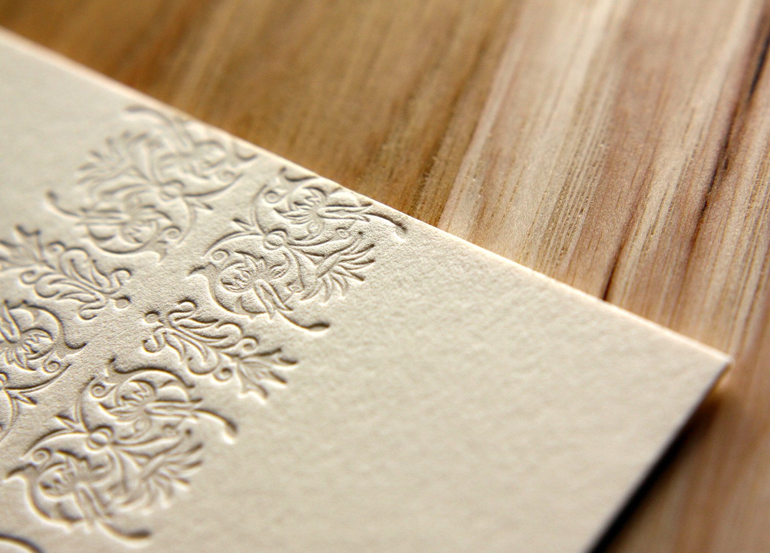
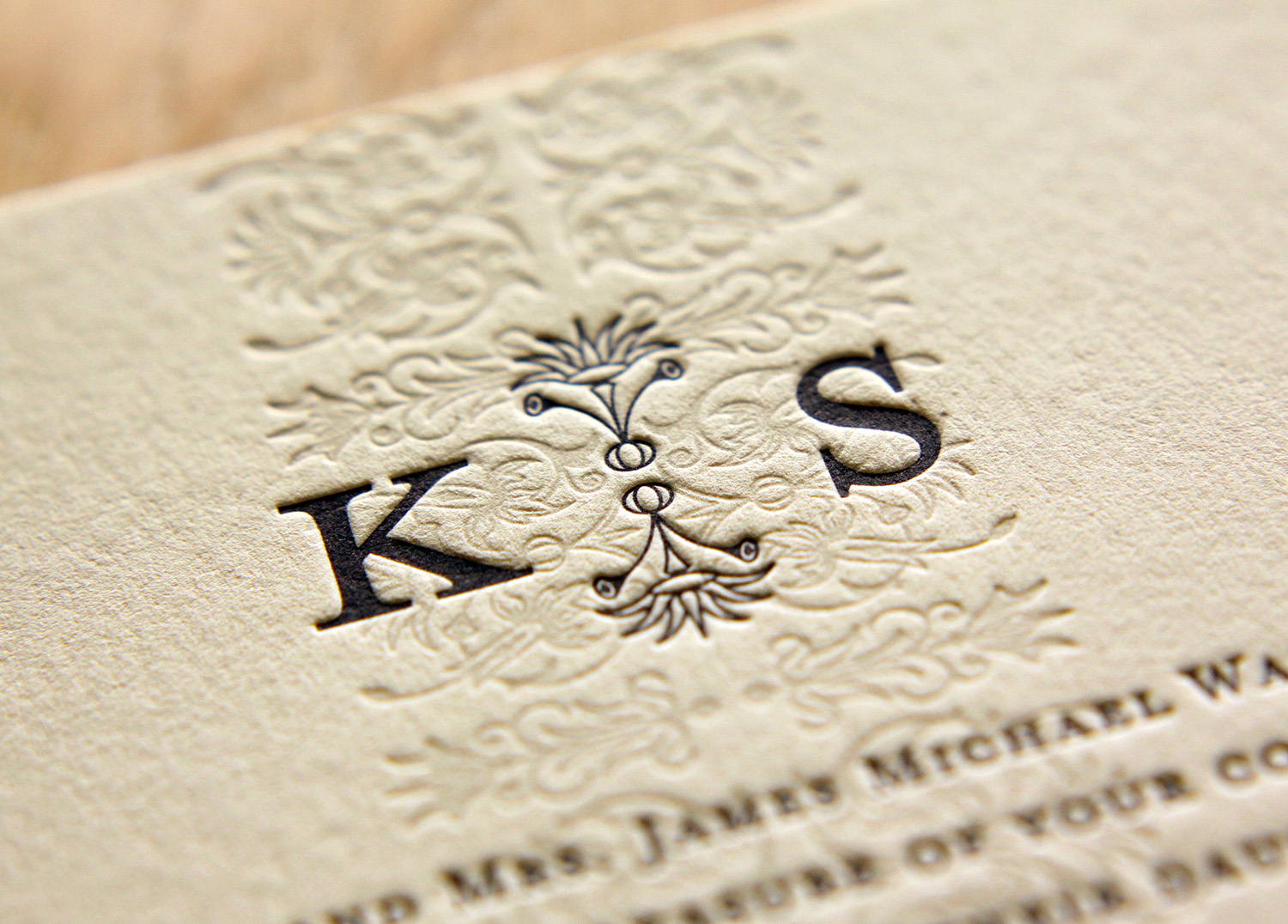
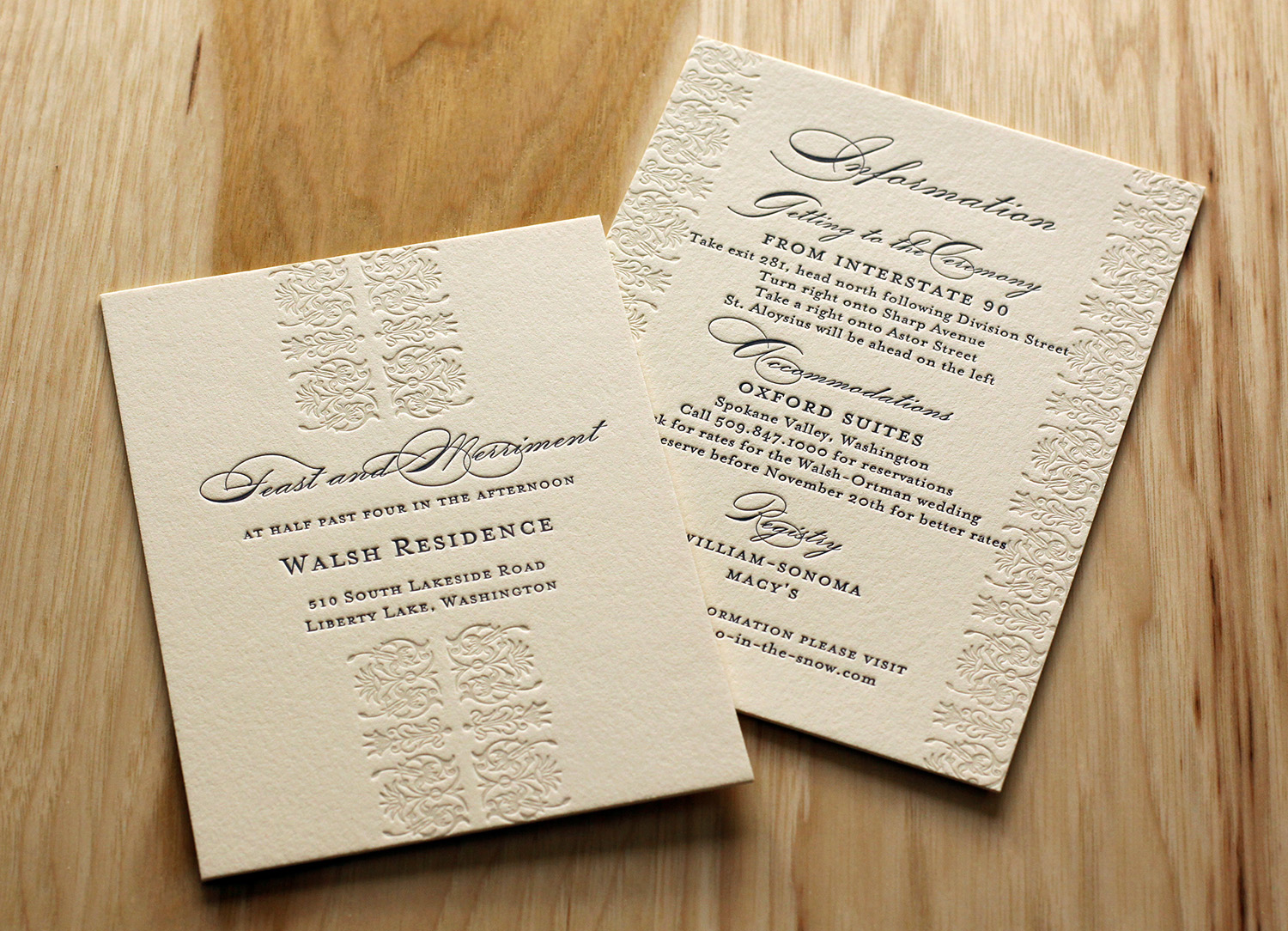
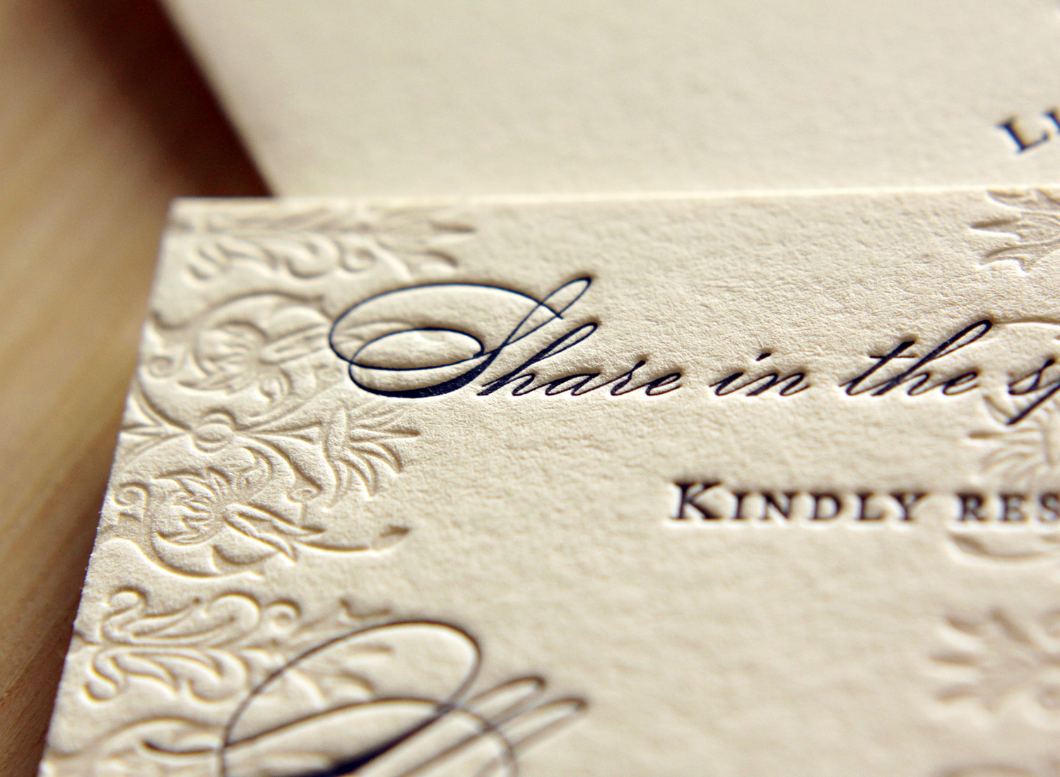
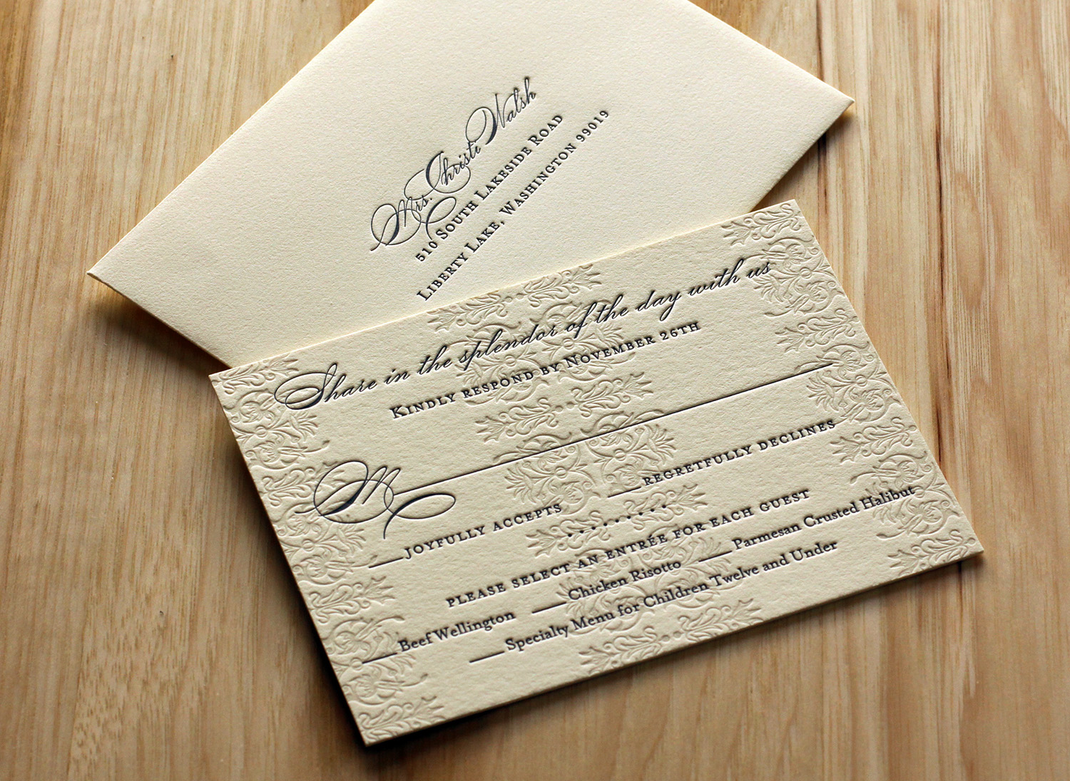
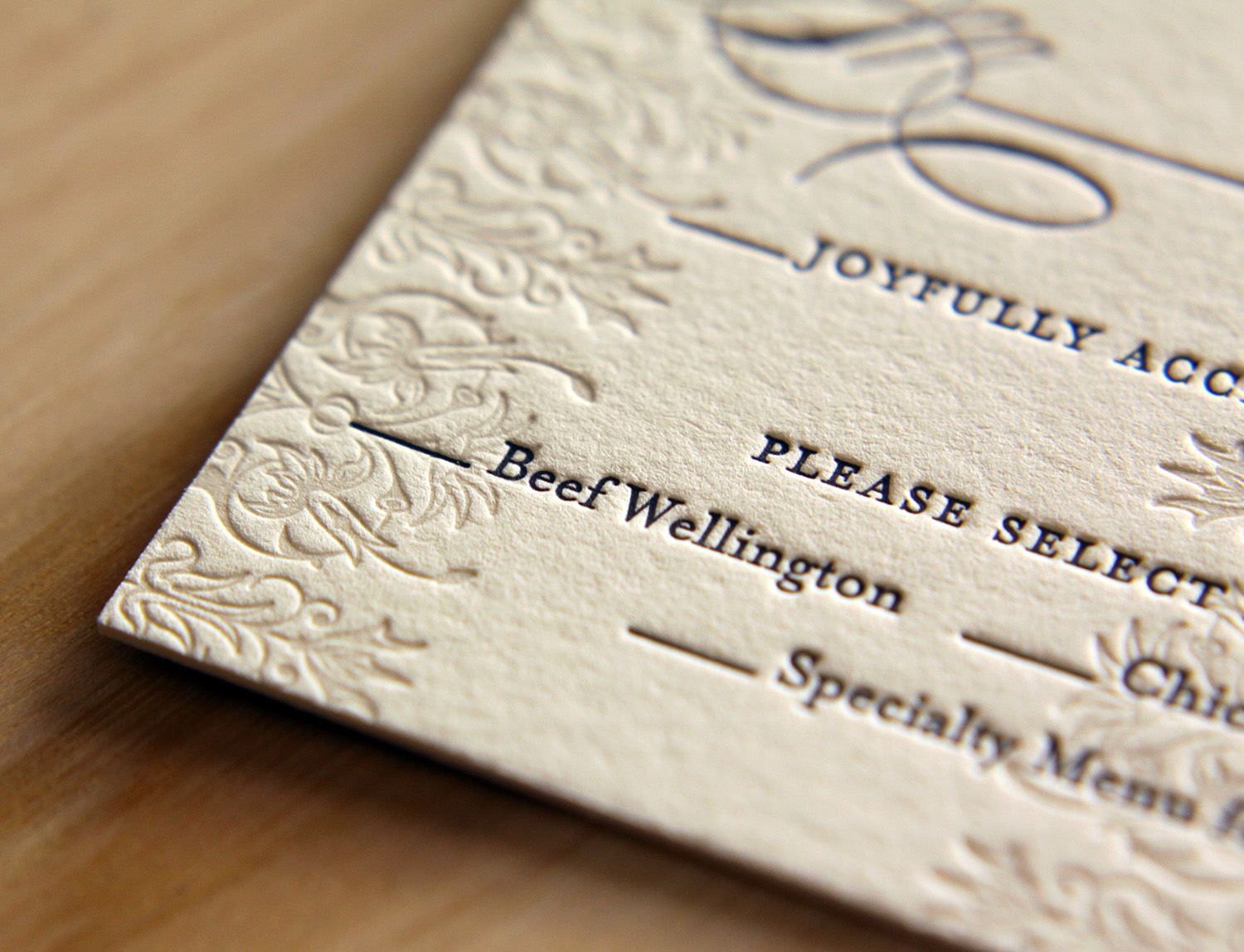
The border design was printed with a very light ink in a warm gray tone. The subtle tone blended well with the paper color, and added texture to the design without appearing as an additional ink color. On each piece of the set — which included an invitation, an RSVP card, a
reception invitation and card providing lodging and directions — the border art was used, either on the edges, as a center strip, or both. The text and monogram were printed in a dark blue, which coordinated with the ivory, blue and gray colors used in the wedding. Kramer felt the mixture of small-caps and script typefaces allowed them to showcase the modern elegance of their wedding, and that the invitation design, along with its colors, gave their guests the "perfect preview" of the event.